Store Metrics
The Store Metrics dashboard provides a comprehensive overview of your Takealot store’s performance, helping you track sales, traffic, and customer behavior over time. Get a complete picture of your store’s performance through core metrics, trend analysis, and promotion analysis.
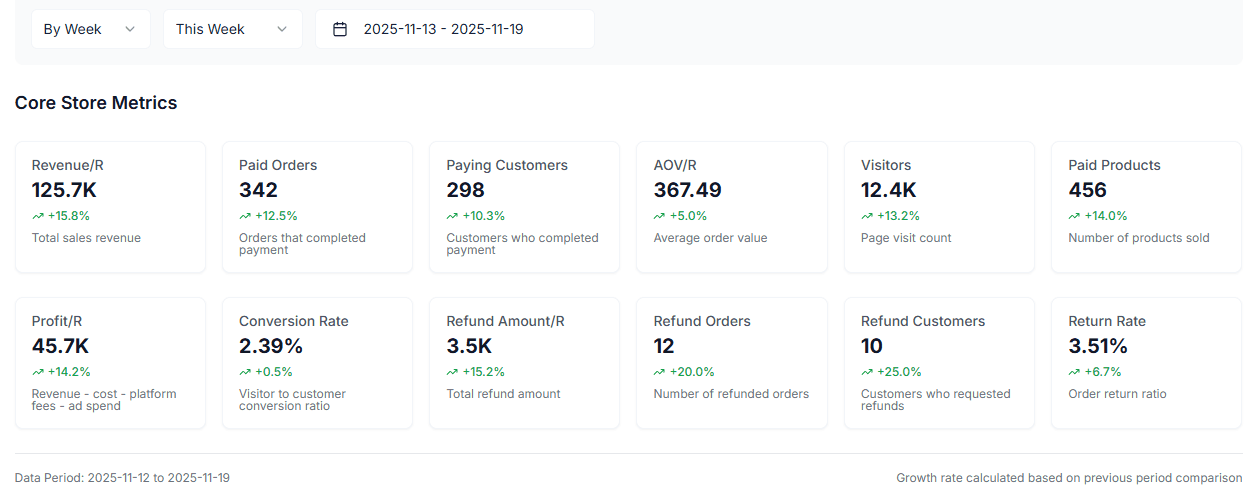
Core Metrics Overview
The dashboard displays 11 core store metrics, organized in two rows:
First Row Core Metrics (6 metrics)
- Total Revenue: Total sales revenue for the selected period
- Total Orders: Number of orders that completed payment
- Total Customers: Number of customers who completed payment
- Average Order Value: Average value per order
- Total Views: Number of product page visits
- Total Products: Number of products sold
Second Row Core Metrics (6 metrics)
- Total Profit: Net profit after deducting costs, platform fees, and advertising expenses
- Conversion Rate: Percentage of visitors converted to buyers
- Total Refund Amount: Total amount refunded
- Total Refund Orders: Number of refunded orders
- Total Refund Customers: Number of customers who requested refunds
- Refund Rate: Order refund rate
Each metric card displays:
- Actual value for the current period
- Growth rate compared to the previous period (if comparison is enabled)
- Metric description and calculation formula (e.g., profit calculation)
Tip: Click on a metric card to quickly highlight that metric’s trend in the trend chart.
Trend Analysis
The multi-metric trend chart visualizes your store’s performance trends over time.
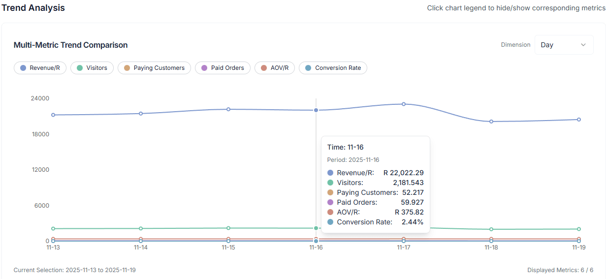
Features
-
Multi-Metric Comparison: Display multiple metrics simultaneously on the same chart, including:
- Total Revenue
- Total Views
- Total Customers
- Total Orders
- Average Order Value
- Conversion Rate
-
Interactive Legend: Click on the legend below the chart to hide or show corresponding metric lines, allowing you to focus on specific metrics
-
Flexible Date Range:
- Preset Ranges: Last 7 days, 30 days, 180 days, This week, Last week, etc.
- Custom Range: Select any date range for analysis
- View by Dimension: Support viewing data by day, week, or month
-
Trend Identification: The chart automatically identifies metric trends (rising, falling, stable), helping you quickly understand business changes
Promotion Analysis
Understand how your promotions are performing and analyze the impact of different promotional activities on sales.
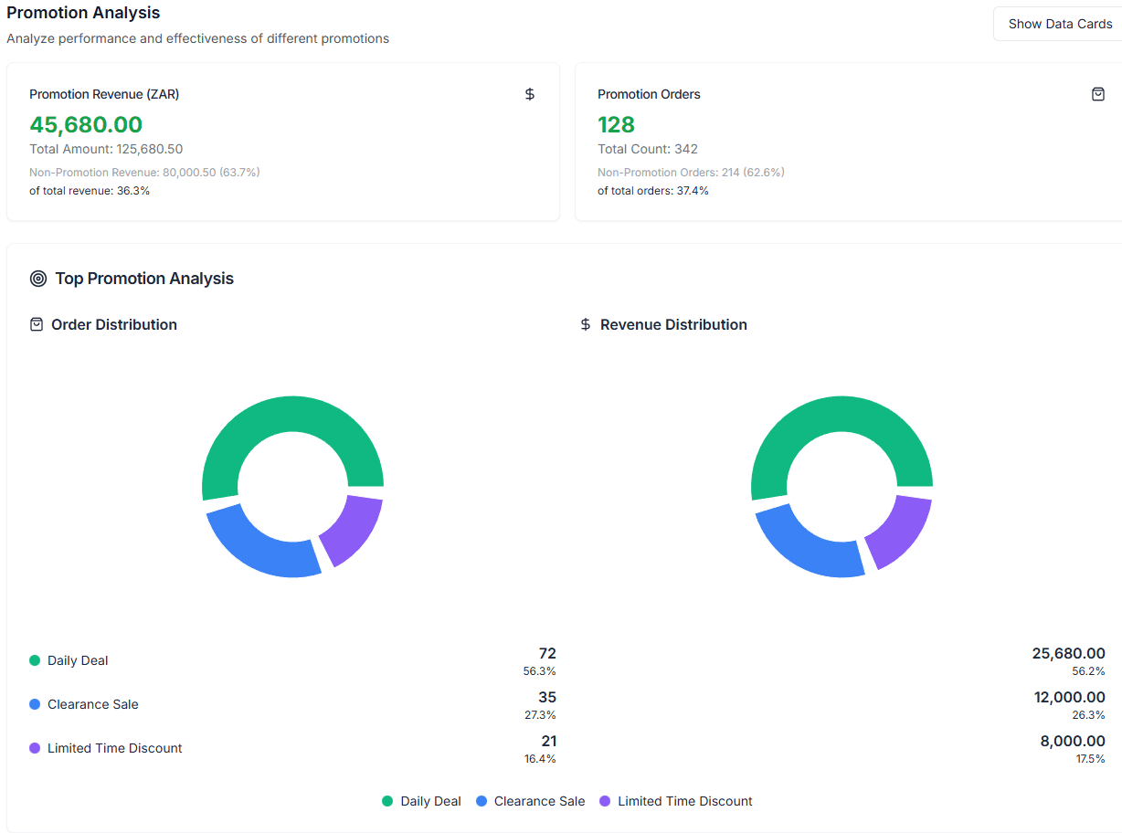
Features
-
Promotion Breakdown Analysis:
- View the percentage of sales from promotions vs. total sales
- View the percentage of promotion orders vs. total orders
- Compare performance between promotional and non-promotional sales
-
Visualization Options:
- Pie Chart Mode: Intuitive display of promotion sales and order distribution
- Data Cards Mode: Detailed display of specific data for each promotion, including:
- Promotion revenue
- Order count
- Average order value
- Percentage of total orders
-
Top Promotions Ranking: View the best-performing promotions to understand which activities drive the most revenue and orders
Tip: Use the toggle button in the top right corner to switch between pie chart and data cards views, choosing the display format that best suits your analysis needs.
Date Range Selection
Flexibly select analysis time periods with multiple preset and custom options:
- Quick Selection: Last 7 days, 30 days, 180 days
- Period Selection: This week, Last week, 2 weeks ago, 3 weeks ago, 4 weeks ago
- Month Selection: Select specific months for analysis
- Custom Range: Choose any start and end dates
After selecting a date range, all metrics and charts automatically update to display data for that period.
Period Comparison
When comparison is enabled, you can view how the current period compares to the previous period:
- Growth Rate Display: Each metric card shows the growth rate percentage compared to the previous period
- Trend Comparison: View comparison between two periods in the trend chart
- Automatic Calculation: The system automatically calculates previous period data for comparison
For example: When selecting “This week”, you can compare “This week” vs. “Last week” performance to quickly understand business changes.
Data Export
Export your store metrics data for offline analysis and reporting:
- Export Dimensions: Support exporting data by day, week, or month
- Comprehensive Data: Includes all key metrics shown on the dashboard
- Excel Format: Export as Excel files for further analysis and processing
Best Practices:
- Regularly export data for backup and analysis
- Use trend analysis to identify business patterns and anomalies
- Combine promotion analysis to optimize promotional strategies
- Monitor conversion rate and refund rate to optimize product and service quality